It’s not often we come across affordable, stylish swimwear here in Sydney, so when we do we’re really keen to let you guys know all about it! We spoke to the designer of new Aussie label RH Swimwear, Ruth Hurley about how to get mixing and matching your swimwear right this Summer!
Whilst matching twin sets is still a strong outfit trend (#twinning), when it comes to swimwear it’s all about creating mixed sets. Buying separates enables us to get creative with our styling, mixing up prints and solid colours to create lots of different styles from only a few pieces, amazing! Not to mention the fact that we can now buy the right size for both our top and bottom, about time!
But for those of you still doubting whether your complimenting or clashing, heres a quick guide to mastering the mix and match look.
Before we jump in it’s worth noting 3 rules that apply to all looks:
1) Always wear the brightest piece on your more favourable section, as it will draw people’s attention to this area. For example, if you’re a little worried about being bottom heavy, try solid coloured bottoms in a mute colour, with a printed top.
2) Keep the style of the swimwear the same on both pieces; for example, don’t wear a skimpy, frilly top with boy short bottoms.
3) Don’t mix completely different fabrics, such as a neoprene with a crochet.
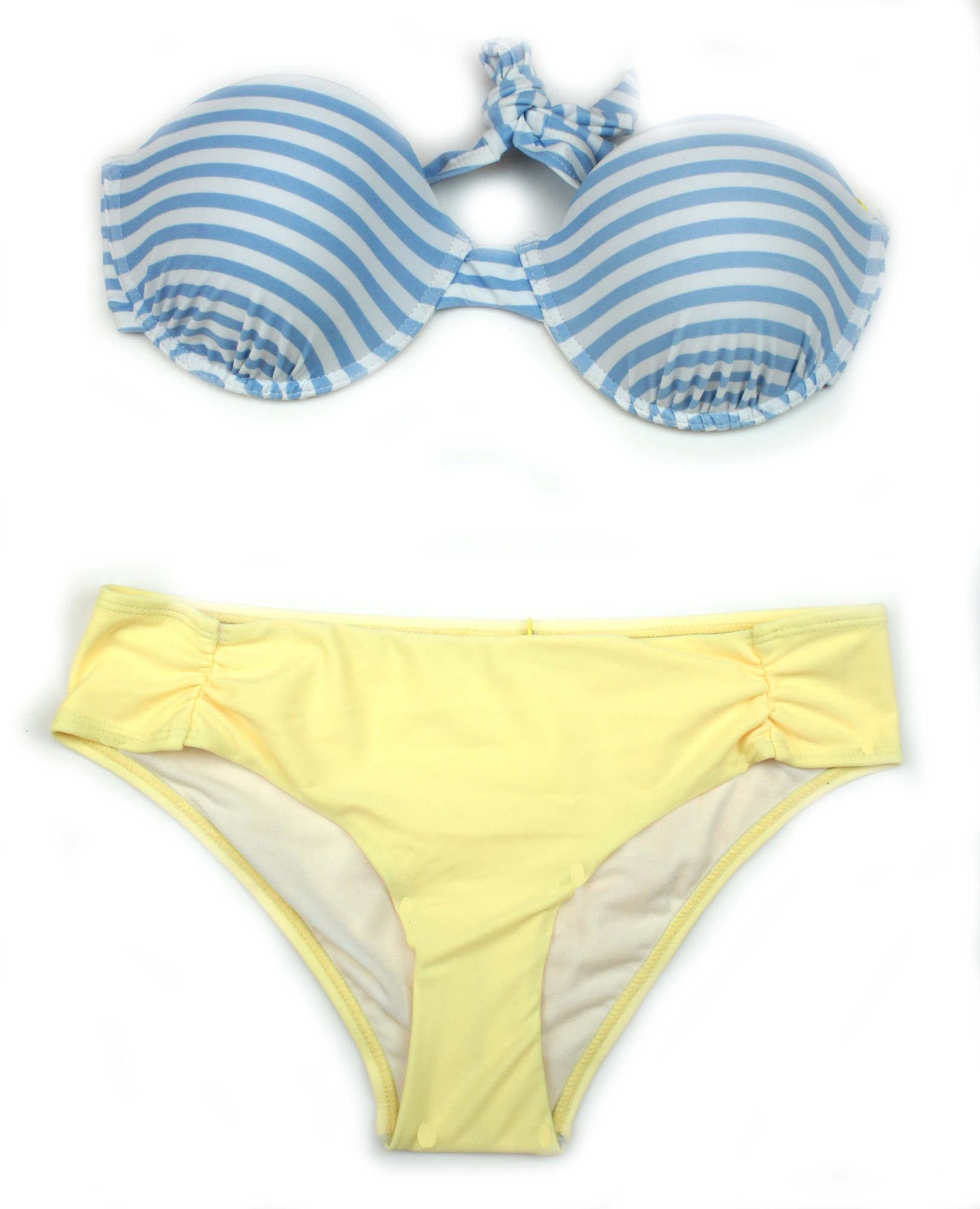
Prints and solids

A great way to nail this look is to pick a solid colour that’s within the print your mixing it with. For an exact match it’s best to buy your top and bottom from the same label, so next time you buy a printed set, grab an extra pair of bottoms in a matching colour.
An alternative is to mix a simple print like a stripe with a contrasting colour, when doing this you just need to make sure that the colours fit together, for example don’t mix a bright summery stripe with plain black.
Prints and prints

This is probably the hardest look to get right but one that’s definitely worth the effort! A good tip is to mix a simple print, such as a chevron, stripe or geometric pattern (a large scale pattern), with a more complex print like an animal print or floral (a small scale pattern).
Basically the aim is for the prints to compliment each other rather than fighting for attention. Maintaining a common colour is always a good tie in, as it will make the mix look more cohesive.
Solids and solids

This is the combination most embraced by the masses probably because it seems like the easiest option, however it’s a look that I see a lot of people getting wrong. A frequent mistake is to mix black with a bright colour like cobalt blue or red. Instead, team black with a taupe or a darker blue, or go monochrome and match it with white.
When mixing colour and colour pick colours that are next to each other or opposite each other on the colour wheel, as these are ‘complementary colours’.

All styles are available at www.rhswimwear.com.au
Leave a Reply